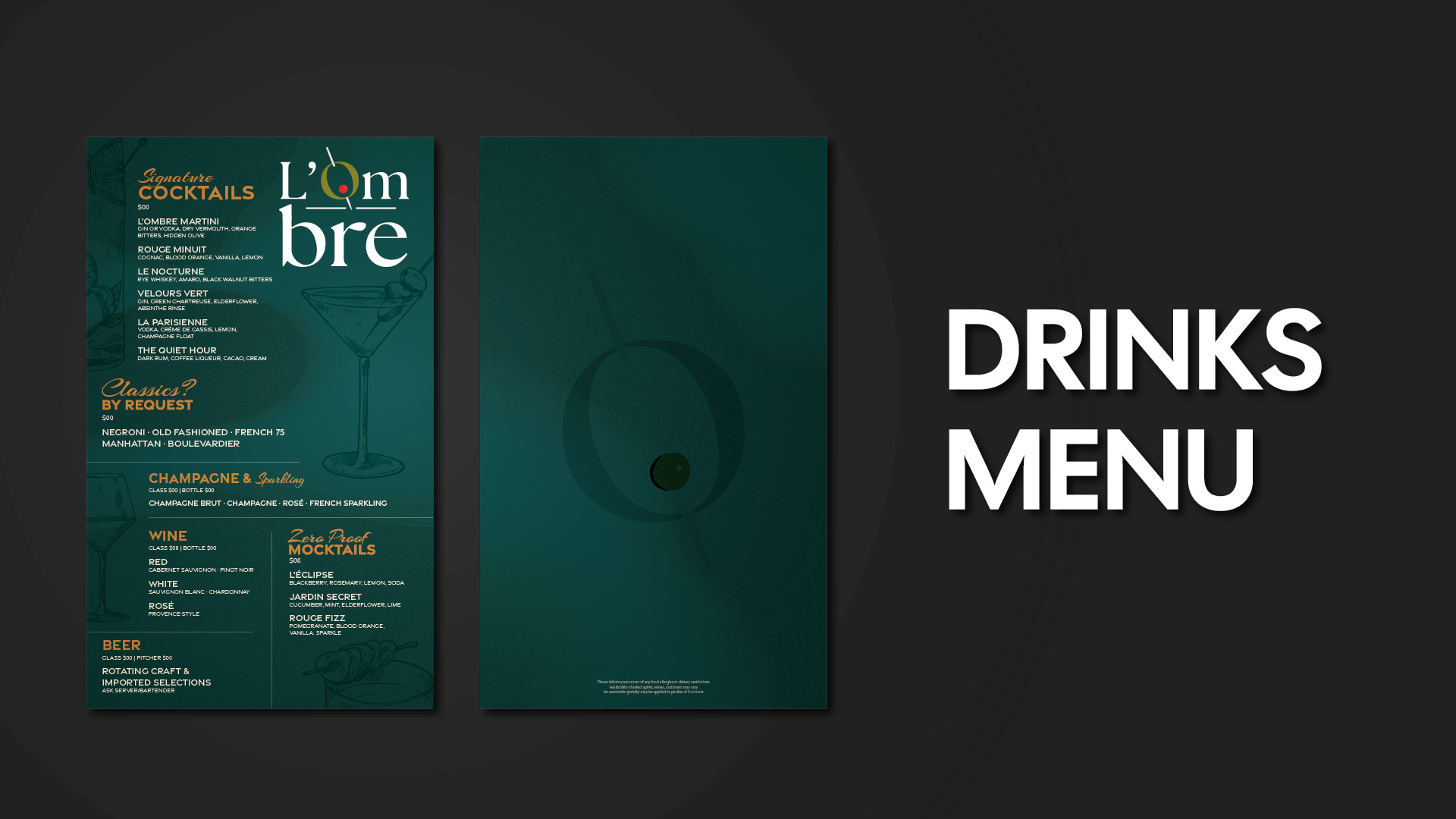
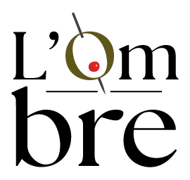
Named after the French word for shadow, L’Ombre exists just out of sight. Inspired by Parisian nightlife and the secrecy of Prohibition-era lounges, the brand is built on quiet luxury; deep tones, refined typography, and subtle symbolism. Every detail is intentional, inviting guests into an intimate space where atmosphere, conversation, and craft take center stage. L’Ombre is not meant to be found by everyone, only by those who know where to look.
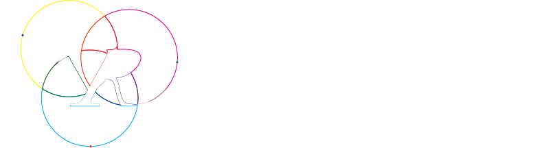
The L’Ombre symbol integrates a hidden olive through form and negative space, referencing classic cocktail culture and the speakeasy’s theme of discretion. Designed to function independently as a logo mark, it also anchors the vertical stacked logo for compact applications. The minimal construction ensures clarity and versatility across print, digital, and environmental uses while subtly reinforcing L’Ombre’s focus on refined cocktails.
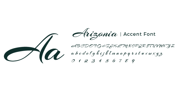
The L’Ombre typography system pairs The Seasons for elegant, editorial titles with Gravesend Sans for clean, modern body copy. Arizonia is used sparingly as an accent, adding a subtle touch of romance and craftsmanship. Together, the fonts create a balanced system that feels timeless, refined, and intentionally understated.


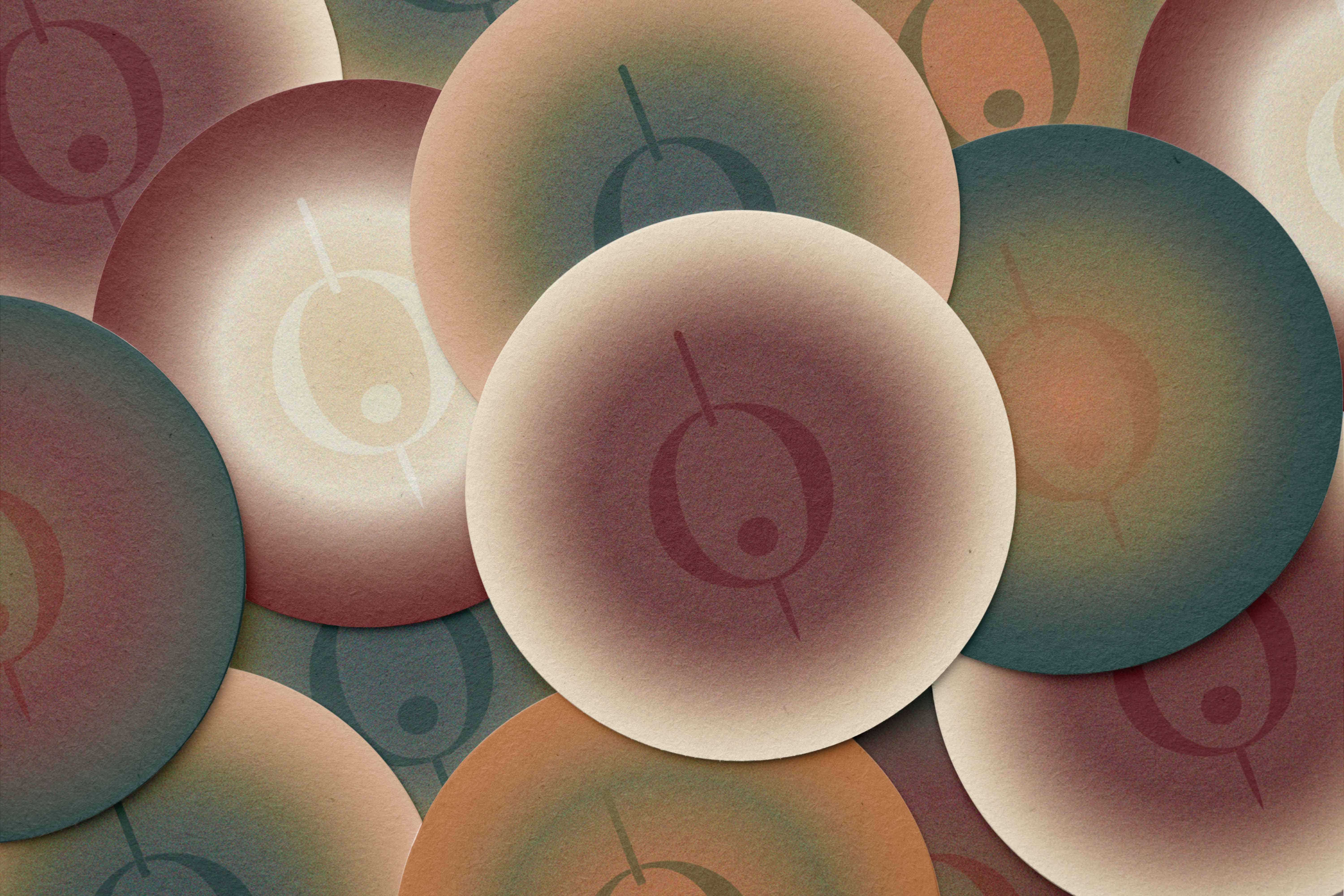
Rooted in depth and warmth, combining deep forest green and rich oxblood red with muted olive and warm copper accents. Soft cream tones balance the palette, adding contrast and refinement. Together, these colors create an intimate, moody atmosphere that reflects classic cocktail culture, quiet luxury, and the allure of a hidden speakeasy.


A full visual identity and event system designed to create a cohesive, engaging virtual conference experience.
Brand-aligned visuals and marketing materials created to enhance storytelling and elevate the guest experience.
A French-inspired speakeasy lounge concept exploring mystery, refined typography, and moody visual design.

In-house Graphic Designer shaping brand experiences, Designing cohesive brand assets across print and digital.
A full visual identity and event system designed to create a cohesive, engaging virtual conference experience.
Brand-aligned visuals and marketing materials created to enhance storytelling and elevate the guest experience.
A French-inspired speakeasy lounge concept exploring mystery, refined typography, and moody visual design.
In-house Graphic Designer shaping brand experiences, Designing cohesive brand assets across print and digital.