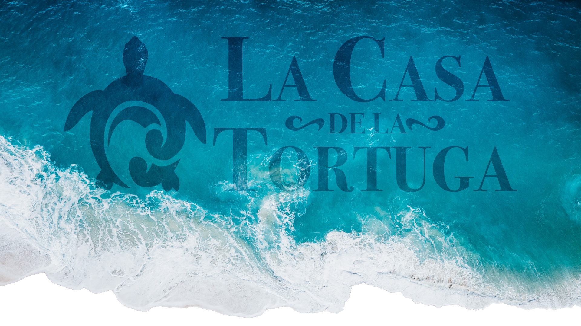
La Casa de la Tortuga is more than a resort, it's a sanctuary. Family-owned and deeply rooted in Mexico's heritage, it invites guests to step away from the rush of modern life and immerse themselves in culture, cuisine, and nature. When Crafting the brand Identity, my goal was to capture that delicate balance: luxury that's grounded, tradition that feels alive, and design that feels timeless.

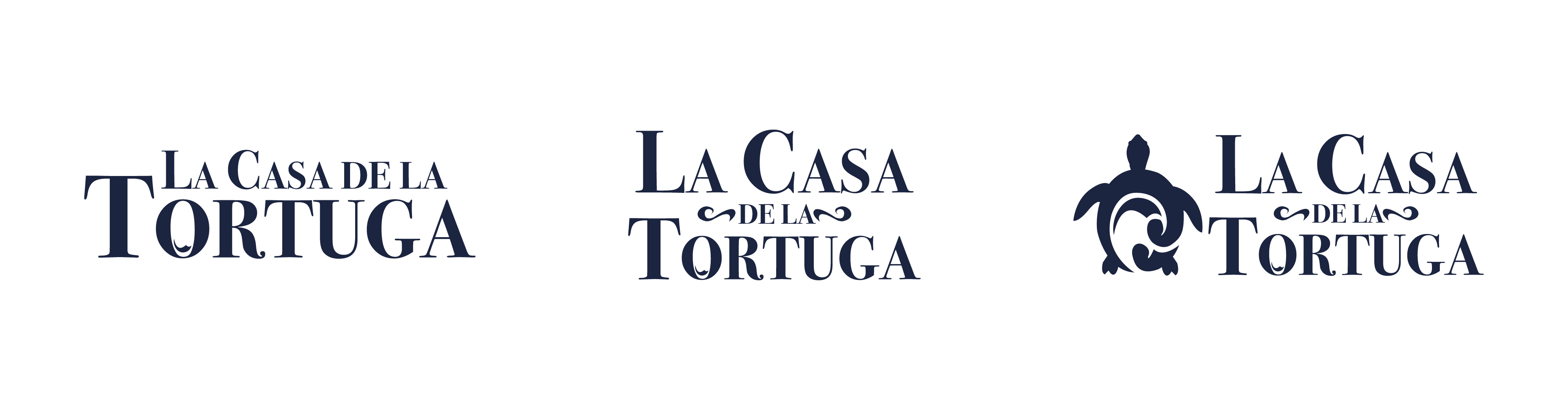
The turtle became the heart of the brand. In Mexico, the sea turtle symbolizes endurance, wisdom, and harmony with nature; values the resort lives by. Paired with bold serif typography, the logo feels both elegant and enduring. It's adaptability allows it to live across touchpoints, from carved wooden signage to embroidered lines, always maintaining it's sense of calm authority.
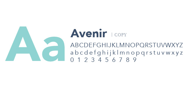
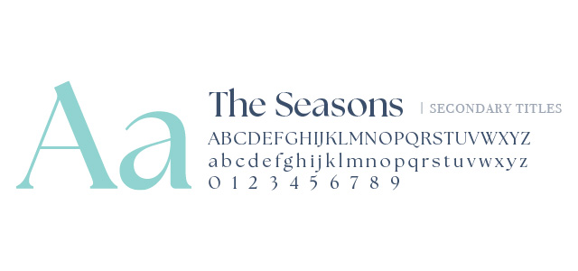
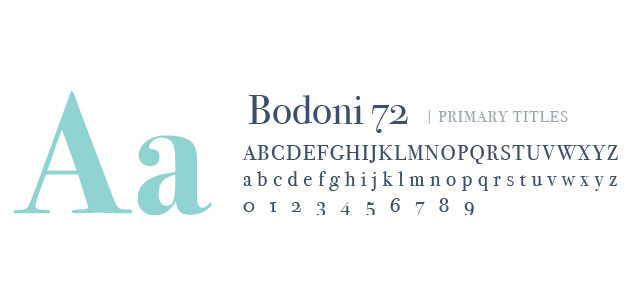
The type system tells a story of contrast and balance.
Together, the fonts echo the guest experience: sophisticated yet welcoming, traditional yet modern.
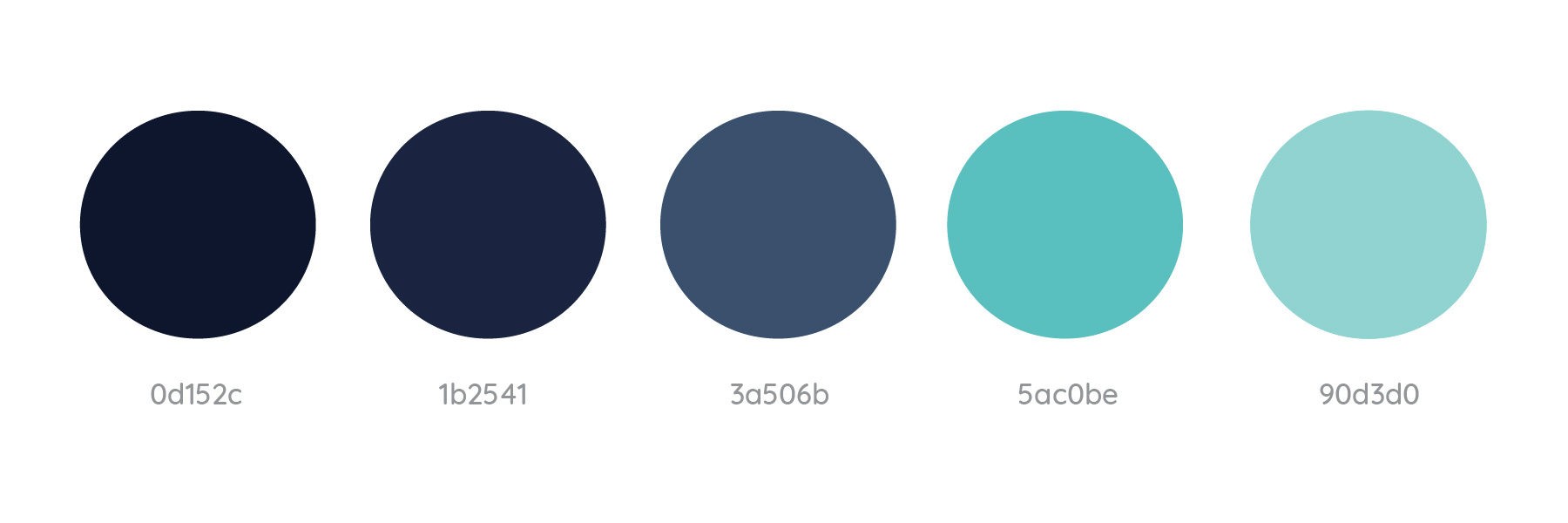
The colors are drawn straight from the Mexican coastline. Deep navy evokes the endless ocean. Aqua tones reflect seafoam and fresh air. Softer turquoise hues symbolize renewal and calm. By weaving these shades together, the palette become a visual translation of a place; a calming, immersive atmosphere that mirrors the resort itself.
La Casa de la Tortuga, a family-owned luxury resort in Mexico, needed a brand identity system that could capture its dual essence: deep cultural heritage and modern coastal luxury. The resort wanted to communicate its commitment to sustainable living, immersive cultural experiences, and serene relaxation—while providing guests with a cohesive experience across signage, print, and advertising.
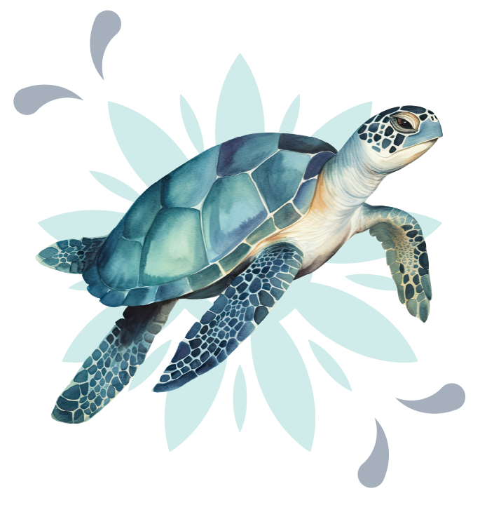

I designed a comprehensive visual identity rooted in three pillars: heritage, nature, and harmony. Drawing inspiration from the turtle as a symbol of longevity, the ocean’s natural rhythm, and traditional Mexican design motifs, I built a brand system that feels timeless yet contemporary.
Logo System: Multiple logo variations anchored by the turtle mark, allowing flexible application across physical and digital environments.
Typography: A refined pairing of Bodoni 72 for elegant titles, The Seasons for secondary styles, and Avenir for clarity in body text.
Color Palette: A spectrum of deep navies and vibrant aquas, balancing grounded sophistication with coastal vitality.
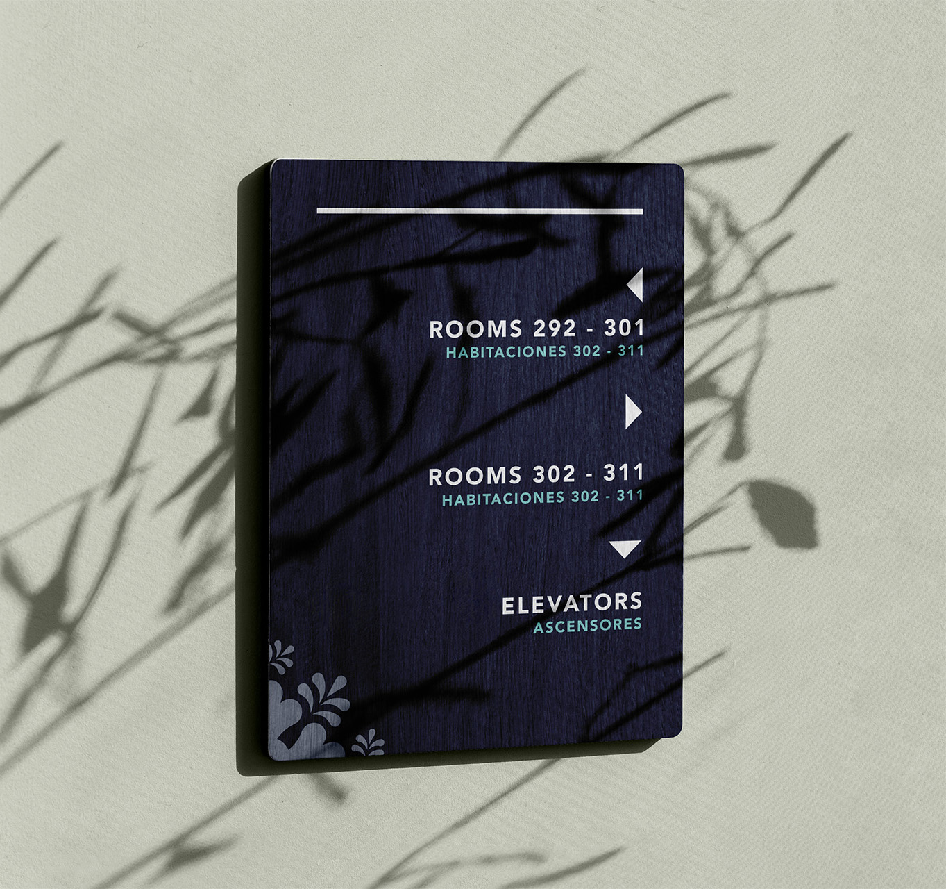
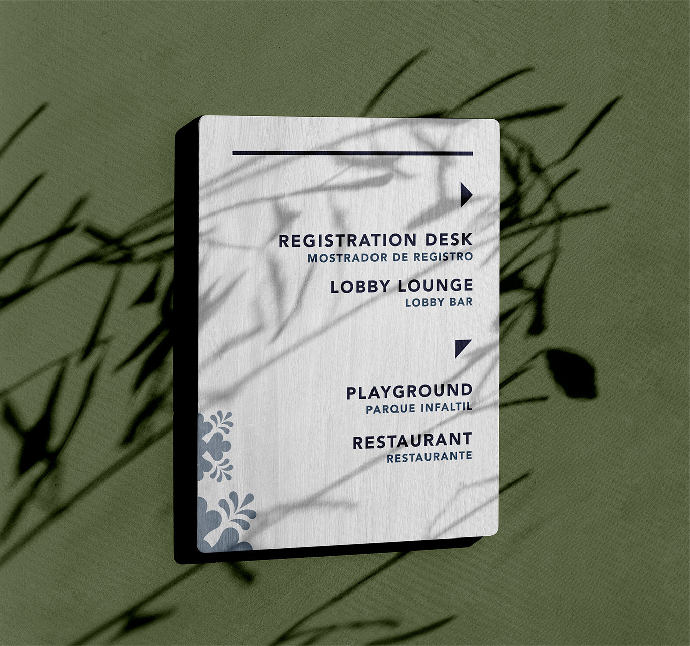
Wayfinding was designed to merge function and beauty.
Exterior Signage: Crisp, light backgrounds with decorative flourishes that welcome guests with warmth.
Interior Signage: Rich navy palettes that elevate the resort’s interior aesthetic while ensuring readability.
Bilingual Clarity: Clean, dual-language typography ensures accessibility for international visitors
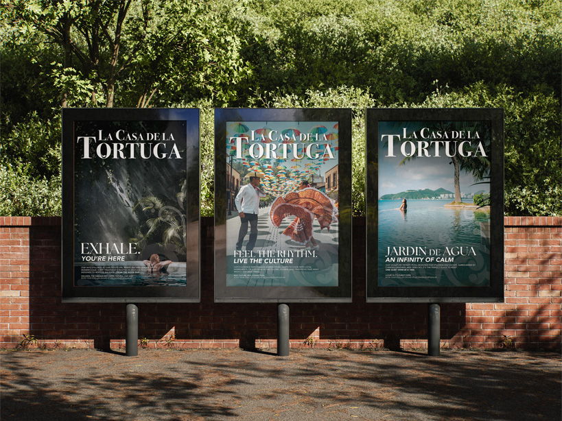
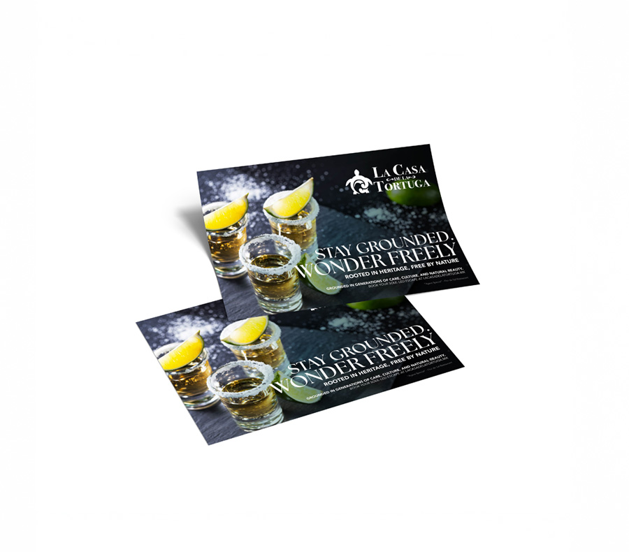
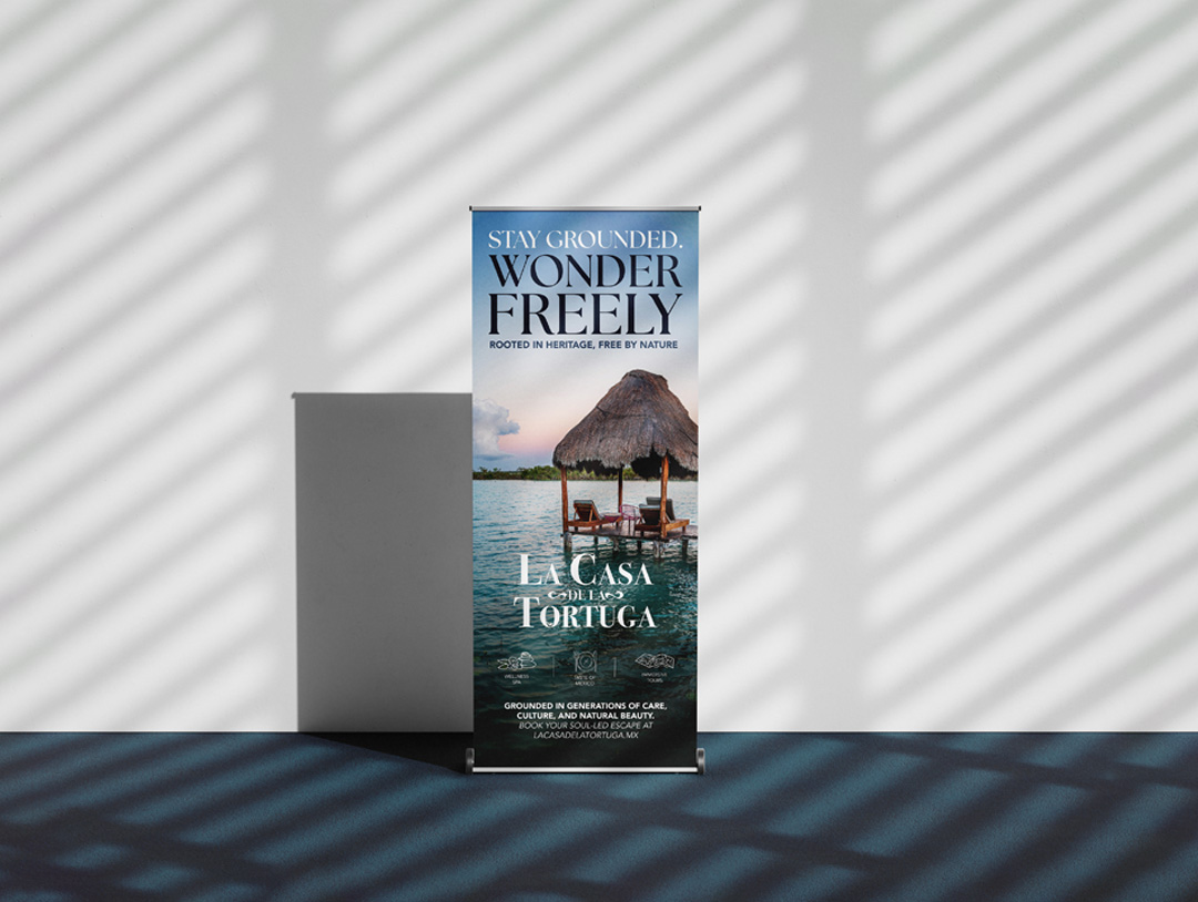
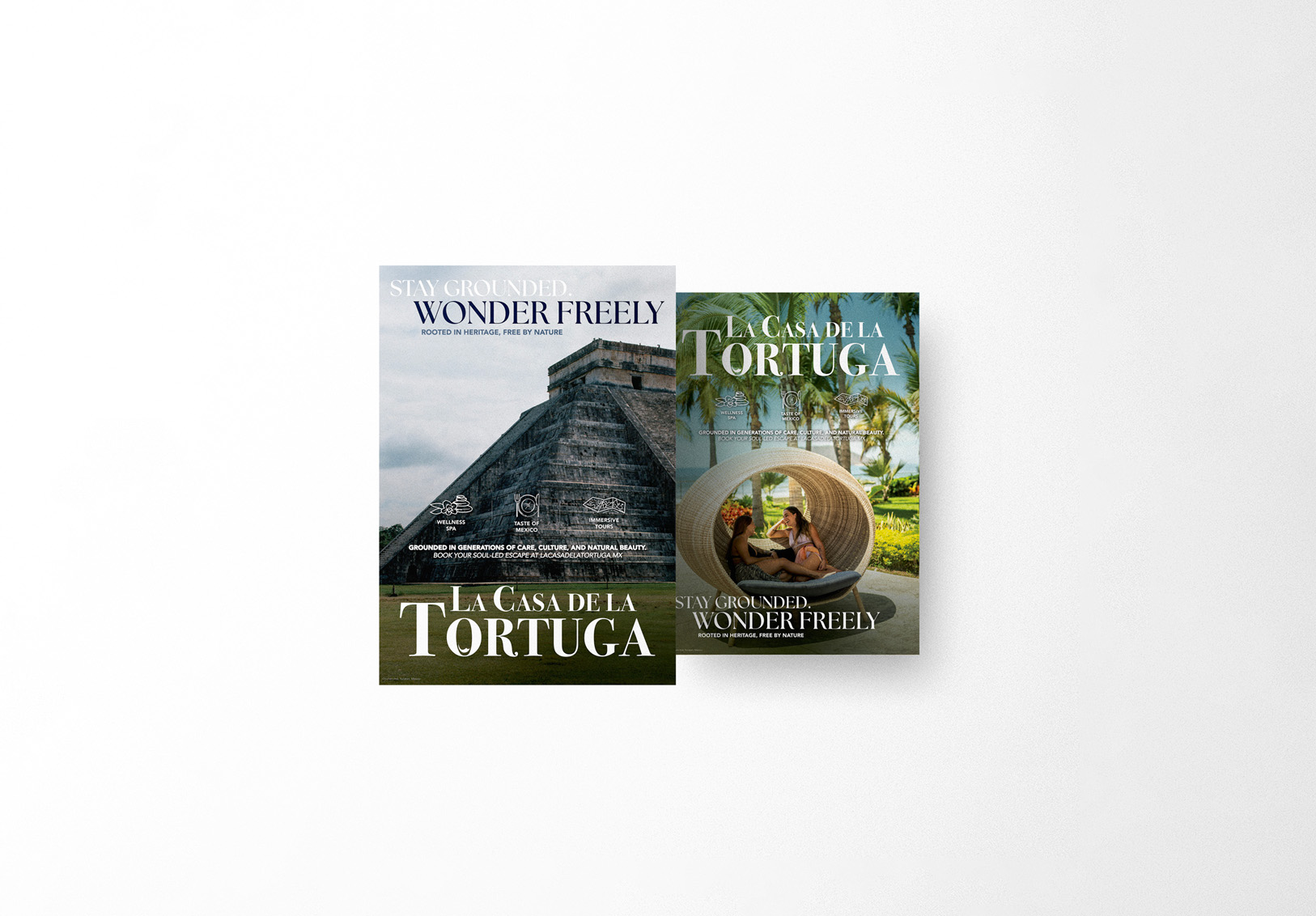
The brand voice “Stay Grounded. Wonder Freely.” was brought to life through multiple campaign assets.
Billboards & Posters: Immersive visuals showcase both natural beauty and cultural richness.
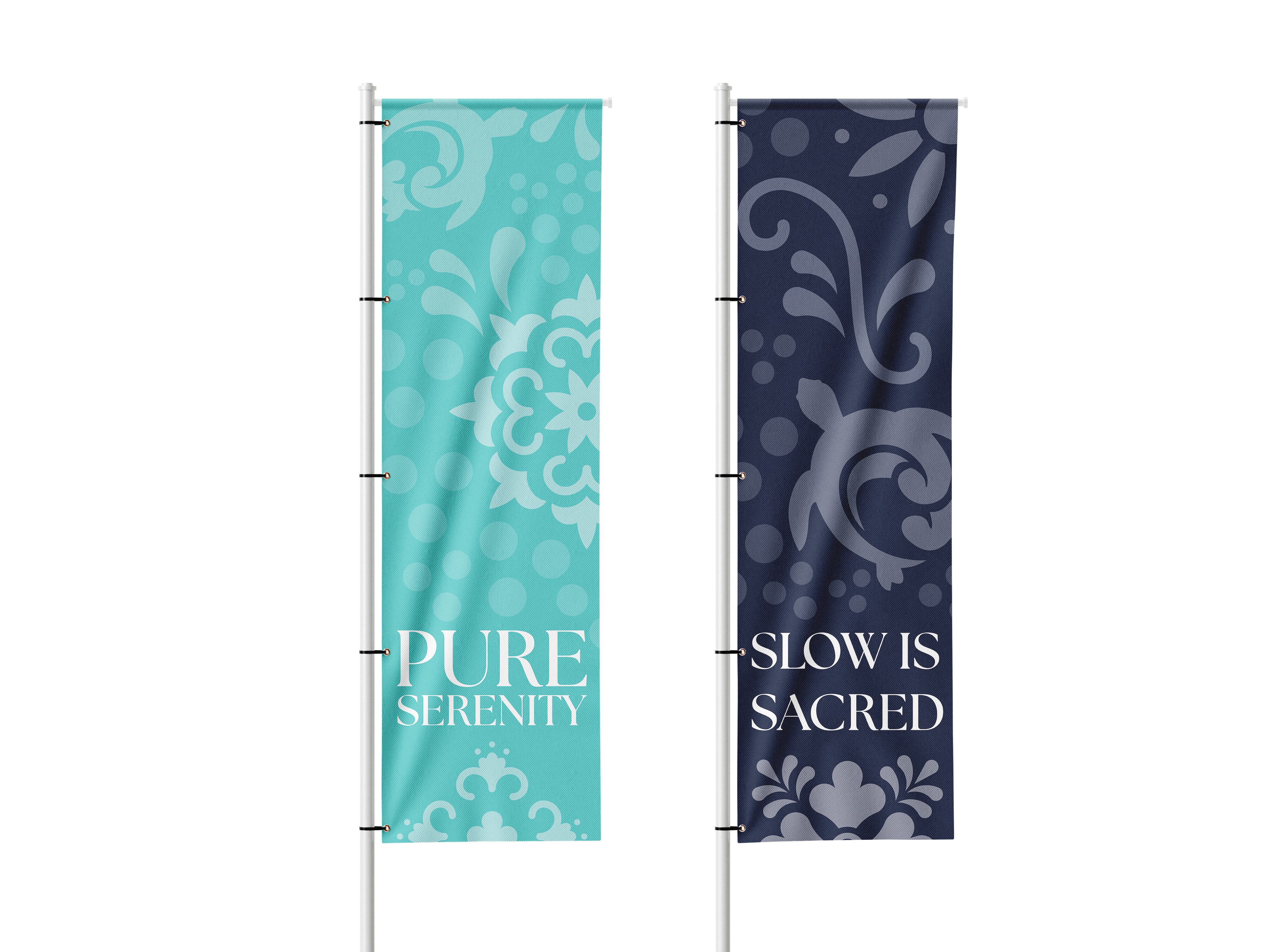
Banners & Flags: Decorative patterns applied to large-scale installations for visual impact across resort grounds.
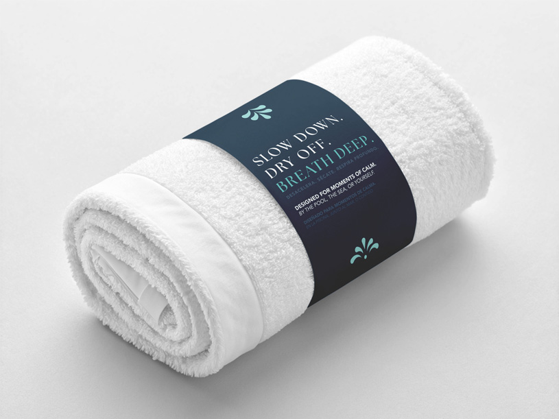
Guest Materials: Postcards and promotional handouts designed as take-home brand touchpoints.

The final identity system reflects La casa de la Tortuga's true essence: a sanctuary where tradition, nature, and luxury coexist.
Guests encounter a cohesive experience at every touchpoint; whether reading a menu at the resort's restaurant, following resort signage, or relaxing by the infinity pool. Each brand asset reinforces the same promise:
Stay Grounded. Wander Freely.
The brand identity positions La Casa de la Tortuga as a Luxury Brand with soul. It's distinctive within the competitive resort market yet deeply connected to it's cultural and environmental context; helping the resort stand out not just as a place to stay, but a place to belong.
La Casa de la Tortuga project was honored with a Silver ADDY Award, recognizing excellence in cross-platform branding. This award highlights the campaign's strength in building a unified experience across print, digital and environmental design, and advertising touchpoints; bringing the resort's story of eco-luxury and cultural immersion to life.